
Graphic design
Nomaad’s visual identity was built to hold its own in the professional interior design and contract sector — a world of architects, hospitality specifiers, and interior designers who work at high standards and judge material quality on sight. The palette grounds itself in earthy, organic tones: deep charcoal and warm olive, with natural off-whites as negative space. This is a deliberate material language, echoing the texture and warmth of the surfaces, fabrics, and wallcoverings the brand sells rather than imposing a graphic identity over them.
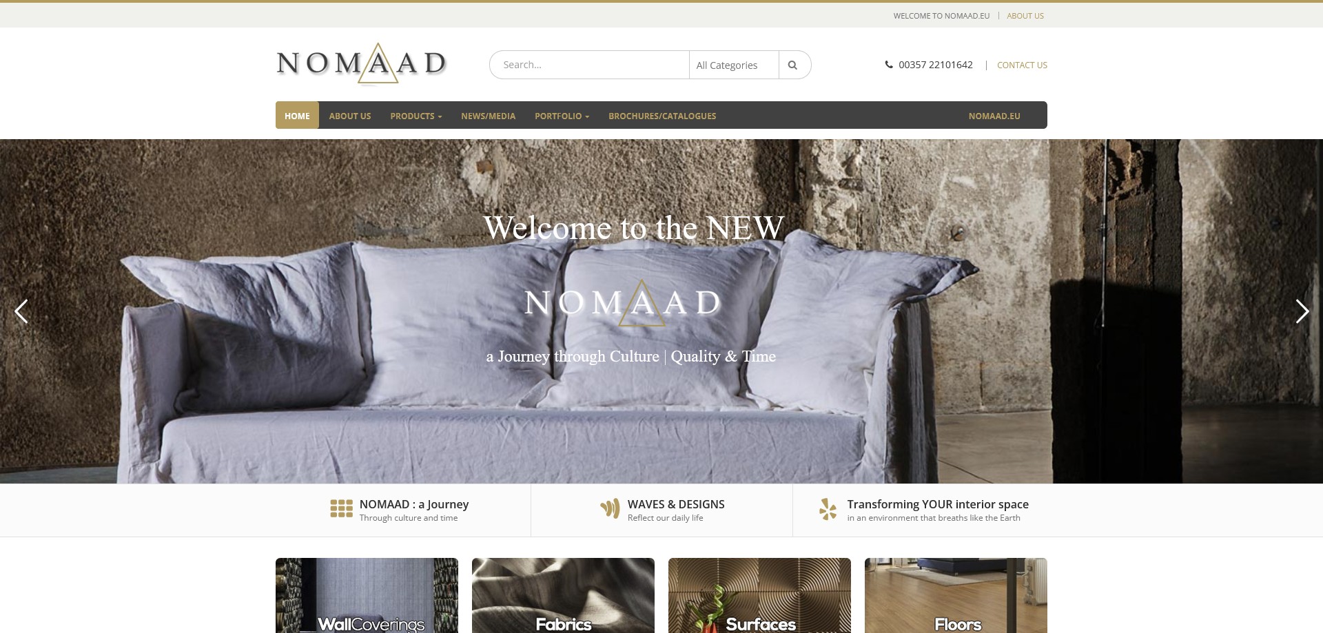
The brand tagline — “a Journey through Culture | Quality & Time” — informed the typographic approach: a refined, slightly editorial mix of display and body type that positions Nomaad above functional trade catalogue territory into something closer to a design house. The inverted logo (white on dark) runs consistently across the site, appropriate for a brand whose products are predominantly shown against rich, dark or textured surfaces.
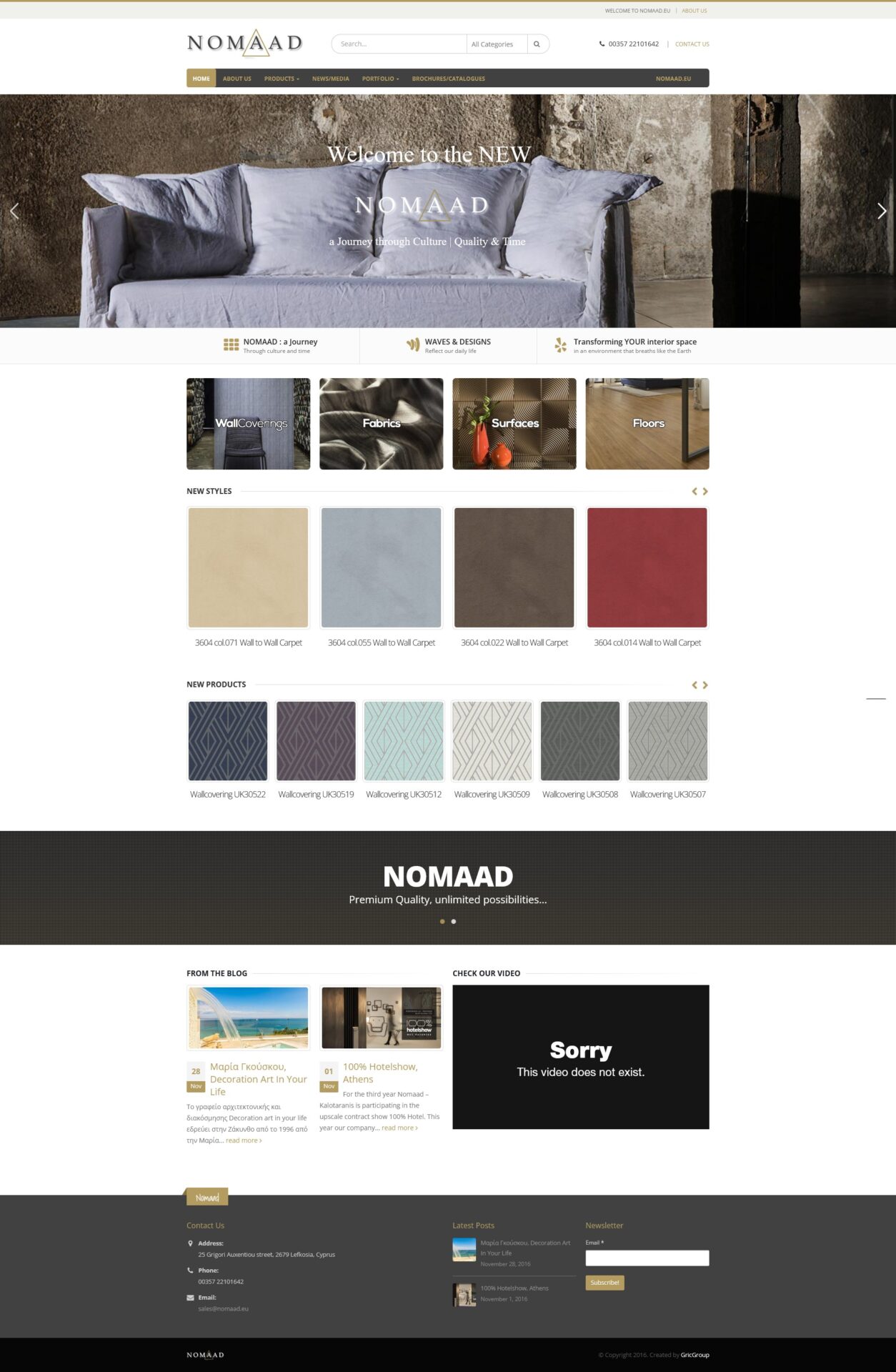
Product imagery is the centrepiece of the design system. With over 2,000 products spanning wallcoverings, fabrics, carpets, vinyl floors, architectural surfaces, and metal mesh collections, the image treatment had to be both visually compelling and practically informative — each product swatch photographed to communicate texture, weight, and finish. The homepage hero slider uses Slider Revolution to cycle between the four main product worlds (Wallcoverings, Fabrics, Surfaces, Floors), each with its own atmospheric visual that opens the category with the same considered editorial feel as an interior design magazine spread.
Design approach
The central UX challenge was navigating a product range of exceptional breadth and technical complexity without the site collapsing into an overwhelming trade directory. With 857 wallcoverings, 145 fabric products, 173 floor products, and 45 surface items — over 2,000 SKUs in total — the information architecture demanded a multi-level taxonomy that allows a professional specifier to drill from category to sub-category to individual product in a logical sequence, while also allowing browsing by design style (Floral/Romantics, Modern, Faux Effects, Traditional, Themes/Vintage) for clients approaching the range creatively rather than technically.
The Metals section — covering Beads, Cloth, Drapery, Ring Mesh, Rope Mesh, and Woven Wire Mesh — received dedicated sub-category treatment, reflecting the architectural and contract specification audience for those materials. This distinction matters: a hospitality designer specifying woven wire mesh for a hotel lobby partition has very different decision criteria from a residential customer choosing a floral wallpaper, and the site architecture accommodates both without conflating them.
A separate Portfolio section — split between Contract and Residential projects — was designed as both a proof-of-capability showcase and a secondary sales tool, allowing prospective B2B clients to see Nomaad materials installed in real hospitality, retail, and residential settings before specifying. A dedicated Brochures/Catalogues section serves the trade workflow directly, allowing designers to download PDFs for client presentations or site meetings.
Technical build
The site was built on WordPress with WooCommerce powering the product catalogue — a B2B catalogue implementation rather than a standard consumer checkout, with the emphasis on product discovery, filtering, and specification rather than cart-and-pay transactional commerce. The WooCommerce taxonomy system was configured to handle the multi-dimensional product hierarchy: product type (Wallcoverings, Fabrics, Surfaces, Metals, Floors), sub-category (e.g. Contract, Plain/Textures, Upholstery), and individual collection pages.