

Graphic design
Architexture’s visual identity had to carry the authority of a 50-year-old market leader in the Greek contract sector while signalling the forward-looking, premium positioning the brand now holds. A near-black base with cool steel-blue accents was chosen to communicate precision and professionalism — the palette of an architectural practice rather than a retail showroom — while remaining warm enough to serve the residential audience alongside the hospitality and commercial one.
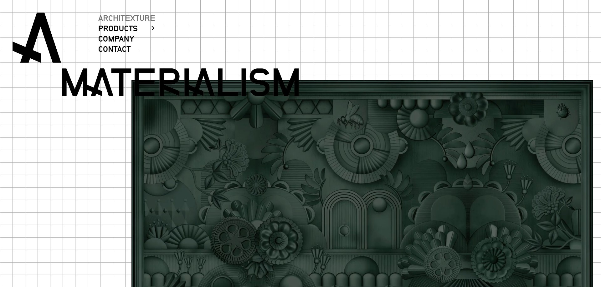
The site opens with a full-screen video hero — a bold statement in the contract interior sector, where most competitor sites default to static product grids. This decision positions Architexture immediately as a design-led company rather than a product distributor, showing materials in situ across hotel lobbies, yacht interiors, conference environments, and luxury residences before a single product category is named. The visual rhythm throughout the site uses wide-margin layouts with generous negative space, letting product imagery breathe in a way that signals quality to an architect or interior designer audience.
Each product category was given its own visual treatment: acoustic materials and wallcoverings emphasised texture and pattern close-ups; the Beautyrest by Simmons beds section adopted a warmer, more lifestyle-oriented visual register to suit its hospitality-specification audience; outdoor furniture was shot in situ on terraces and pool decks. This visual differentiation across categories ensures the site never feels like a monotonous catalogue, even as the product range spans from mattresses to architectural mesh panels.
Design approach
The primary audience is professional: architects, interior designers, hotel procurement managers, and shipping company project leads. These users arrive with specific requirements and limited patience for browsing. The site’s navigation was structured to serve this reality — direct access to product categories from the main menu, a Company page that establishes credentials and client sector coverage upfront, and a dedicated contact page with multiple office and showroom addresses for in-person meetings.
The product range is uniquely broad for a single B2B supplier: acoustic materials and wallcoverings, architectural design materials, Beautyrest by Simmons luxury hotel beds (across seven sub-lines including Beautyrest Black, Harmony, Sensory, and Resort), fabrics and linen, indoor and conference furniture, lighting solutions, outdoor furniture, and carpets, rugs and flooring. This breadth is a commercial strength — positioning Architexture as a one-stop procurement partner for entire hotel fit-outs — but a design challenge if it is presented as a flat product list. The solution was a tiered product hierarchy where each top-level category resolves into its own landing page with product sub-collections, allowing both browsing and targeted specification.
The client sector taxonomy — Hospitality & Marine (hotels, shipping companies, luxury residences), Commercial & Institutional (construction firms, retail, museums, healthcare, education), and Residential — was surfaced in the Company section to help prospective clients self-identify quickly and understand the depth of Architexture’s sector experience before requesting a consultation.