

Graphic design
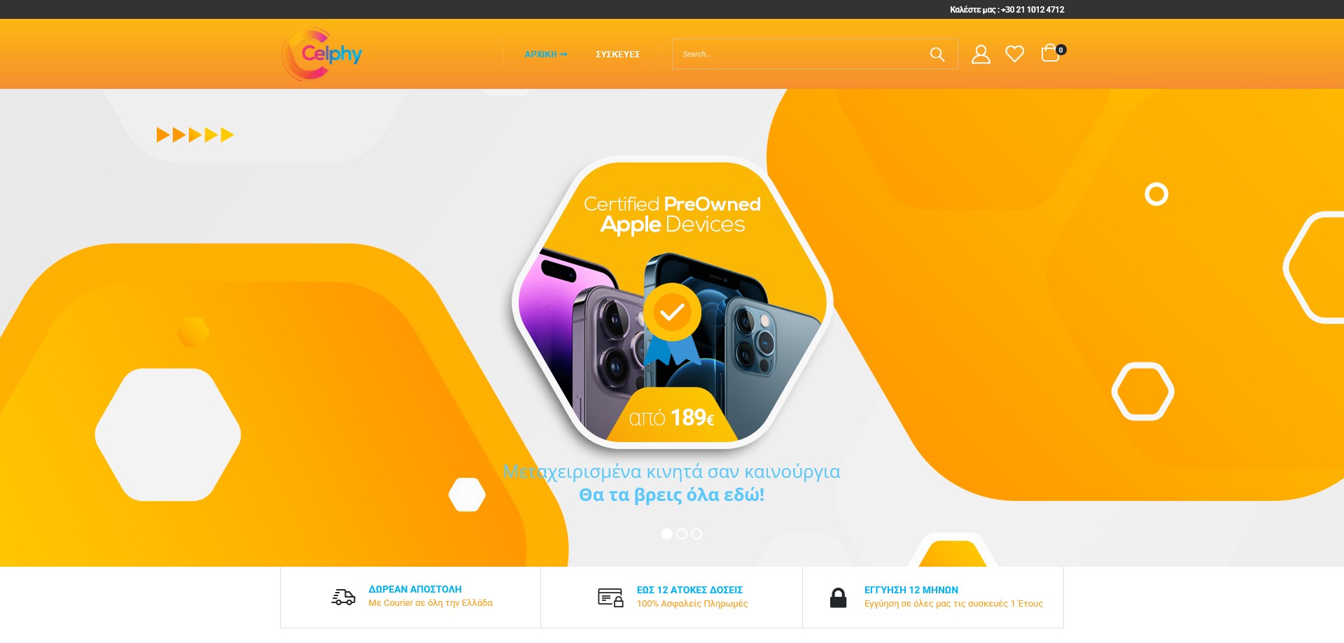
Celphy operates in a market where trust is the primary conversion barrier — refurbished smartphones are a considered purchase and customers are understandably cautious about buying a second-hand device online. The visual identity was built to overcome that hesitation immediately: a clean, tech-forward aesthetic built on a deep navy base with sharp electric blue accents, placing the brand firmly in the same visual register as a credible electronics retailer rather than a classifieds marketplace.
The brand name “Celphy” — a deliberate play on “cell” and “self” — is reinforced through clean, modern typography that communicates tech literacy and confidence. Product photography follows a strict, consistent approach: each device photographed at a standard angle against a clean light background, with colour variants shown accurately (Aura Glow, Black, Blue, Grey, Rose Gold, White) so customers can make confident decisions without handling the device. This consistency across hundreds of product listings creates a professionalism that directly supports conversion.
The three homepage hero slides — “Μεταχειρισμένα κινητά σαν καινούργια” (Refurbished phones like new), “3 interest-free instalments & 12 months guarantee”, and “FREE nationwide delivery” — were designed as a deliberate three-part trust sequence. Each slide addresses a different purchase objection in order: quality anxiety, financial risk, and logistics friction. The Slider Revolution hero was treated as a conversion funnel in visual form, not a simple promotional banner.
Design approach
The grading system — Grade A (perfect condition), Grade B (minimal cosmetic wear), Grade C (noticeable cosmetic wear) — is the central trust mechanism of the entire site and was given prominent design treatment on every product page. Rather than burying condition information in small print, each product page surfaces the grade clearly with its definition, allowing customers to calibrate expectations and price sensitivity precisely before adding to cart. This transparency-first approach is both an ethical design choice and a commercial one: it dramatically reduces post-purchase dissatisfaction and return rates.
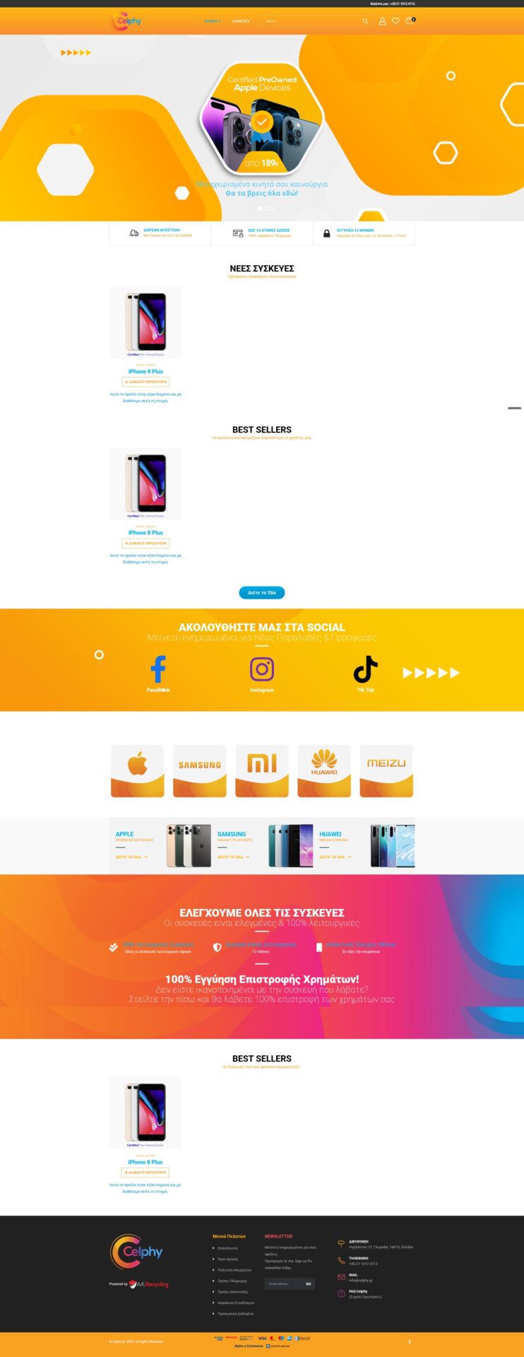
Navigation is organised by brand — Apple, Samsung, Huawei, Xiaomi, Sony, Nokia, Meizu — reflecting how customers in the refurbished market search. Unlike new device shopping where someone might browse by feature set, refurbished buyers almost always start with a specific brand or model in mind. The brand category pages show the range available within each manufacturer, with sub-filtering by storage capacity (128GB, 256GB) and colour supporting the final decision step.
Three trust badges — free nationwide delivery, up to 12 interest-free instalments, and a 12-month guarantee on all devices — are surfaced on the homepage as standalone visual elements above the fold, ensuring they are seen before a single product is browsed. These aren’t afterthoughts; they were treated as primary design content given their direct impact on purchase confidence.
Technical build
The site was built on WordPress with WooCommerce, using a custom theme to deliver the brand’s clean tech aesthetic with the product-display precision the refurbished market requires. The WooCommerce catalogue handles product variations for storage size and colour across multiple brand categories, with stock management reflecting the variable availability characteristic of a refurbished inventory — individual units rather than bulk stock runs. Slider Revolution powers the homepage hero sequence.