
Graphic design
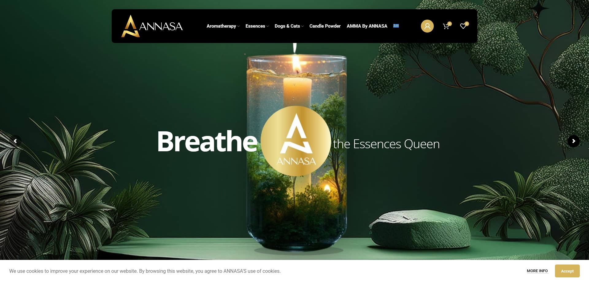
The visual identity was crafted to reflect a brand that markets itself as “The Essences Queen” — a title that demands a design language of genuine opulence. A palette of deep warm blacks and rich espresso tones forms the base, with burnished gold and warm ivory as accent tones that echo candle flame, natural wax, and the luxury of French perfumery. The result sits closer to a high-end fragrance house than a typical candle shop, which is precisely the positioning the brand requires.
Typography was selected to carry dual weight: a refined serif for the brand name, collection titles, and editorial moments — evoking the artisanal heritage of the French master perfumers behind the formulas — paired with a light, elegant sans-serif for product descriptions, ingredient callouts, and navigation. The contrast between the two creates a rhythm that feels intentional and cultured rather than generic.
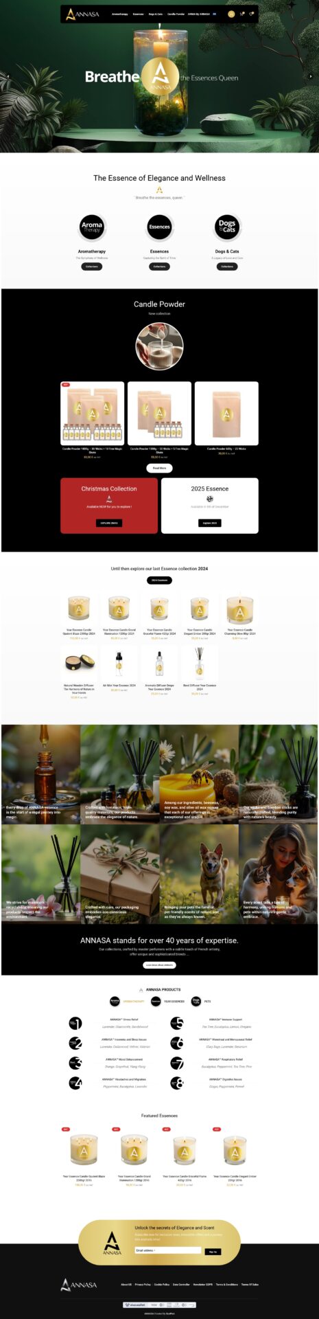
Product photography treatment was central to the graphic design work. Candles, reed diffusers, wooden diffusers, and glass vessels were styled and shot against dark atmospheric backgrounds to match the brand’s editorial tone, with lifestyle compositions used across collection headers and the homepage hero. Custom graphical elements — product size and burn-time callouts, collection badges, and the Year Essence annual series artwork — were designed within a consistent visual system that scales across digital and packaging contexts. The pet line, Ralf’s Collection, received its own sub-identity: warmer, softer tones that communicate care without breaking from the parent brand’s premium aesthetic.
Design approach
The UX challenge was navigating a product range of genuine breadth and sophistication — luxury candles in multiple sizes (80g up to 2300g), reed diffusers, wooden diffusers, aromatherapy drops, candle powder, an annual Year Essence series spanning over a decade, a therapeutic aromatherapy line covering conditions from insomnia to respiratory relief, and a dedicated pet collection — without the site feeling cluttered or unfocused.
The solution was a layered taxonomy: top-level navigation organises by product type (candles, diffusers, aromatherapy, essences, pets), while within each section, filtering by sub-collection, size, and therapeutic purpose allows customers to locate exactly what they need. Quick-view and wishlist functionality were prioritised to reduce friction in a catalogue where a customer may want to compare multiple products before committing.
Each product page leads with sensory language — top notes, heart notes, mood and therapeutic effect — mirroring the language of a perfume counter. This wasn’t just copywriting: the layout was designed to give these descriptions visual prominence, treating fragrance composition as a feature specification rather than an afterthought.
Technical build
The site was built on WordPress with WooCommerce, with a custom theme developed to realise the brand’s visual identity precisely — the standard theme ecosystem doesn’t get close to this level of editorial control without bespoke development. WooCommerce handles a deep product catalogue with multiple category taxonomies, product variations (size, burn time, format), VAT-inclusive pricing for EU customers, and same-day or next-working-day dispatch logic with 1–3 day delivery windows.
A wishlist system was integrated to support the browsing behaviour of a gift-driven customer base. The Year Essence archive — spanning annual editions from 2016 through 2026 — was structured as a dedicated filterable collection, functioning as both a shop and a brand heritage showcase. GDPR-compliant cookie consent was implemented for the EU-registered domain, and the delivery and shipping logic was set up to accommodate both standard Attica delivery and extended-reach zones requiring prior arrangement with customer service.