

Graphic design
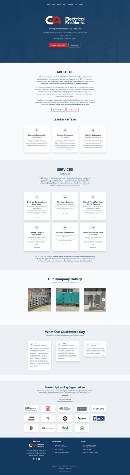
C & A, Inc. is a woman-owned, Certified Business Enterprise that has been serving the Washington D.C. metropolitan area since 1977 — nearly five decades of licensed, bonded electrical and fire alarm work for residential, commercial, and government clients. The visual identity had to carry that institutional weight while remaining approachable and modern. A deep navy-charcoal base with warm amber accent tones communicates technical authority and dependability without the cold anonymity of a generic contracting company website. Amber — the colour of illuminated circuits, warm lighting installations, and active signals — is a natural choice for an electrical and lighting specialist.
The “GetLightNow” brand name and domain is bold and action-oriented — a direct-response positioning statement that cuts through the often generic naming conventions of the electrical contracting sector. The logo was designed to be clean, professional, and versatile across the company’s diverse service scope. Typography is structured and confident: strong heading treatment for section titles paired with highly readable body copy suited to the technically detailed service descriptions the site requires.
A company gallery of optimised WebP images — showcasing installations, site work, equipment, and the team in action — was treated as a core visual section rather than an afterthought, building the social proof that prospective clients in the D.C. metro area need before trusting a contractor into their home or commercial property. Customer testimonials from named homeowners across Silver Spring, Ashton, and Washington D.C. were displayed as a dedicated section, reinforcing the family-run, locally trusted identity of the business.
Design approach
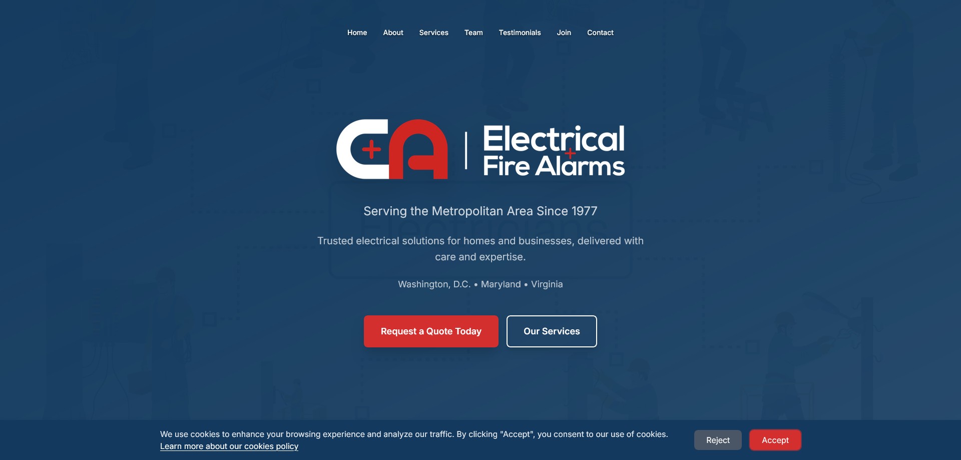
The site was designed as a single-page layout with anchor navigation — an efficient architecture for a service business where the conversion goal is straightforward: get a prospective client to submit a quote request or pick up the phone. The section flow follows the natural trust-building sequence for a contractor relationship: hero statement → About (who we are, how long we’ve been in business) → Services (what we do) → Team (who will do the work) → Testimonials (why you should trust us) → Contact. Each section earns the next.
The leadership team section was designed with deliberate prominence — naming and profiling Evangelia Rodousakis (President & CEO, 20+ years experience), Stephan Rodousakis (Vice President, Master Licensed Electrician across MD, VA, and D.C.), and Markus Rodousakis (Director of Operations & HR). For a family business built on integrity and reputation, humanising the leadership is a more powerful trust signal than any credential list. The woman-owned and CBE certification status is surfaced clearly in the About section, addressing government and corporate procurement requirements directly.
A dedicated “Join Our Team” section and page acknowledges that the company is actively growing, serving dual purposes: talent acquisition and a secondary signal of business health that reassures prospective clients that the company has the capacity to take on new projects.
Technical build
The site was built as a custom HTML/CSS static site with a fully custom design — a deliberate departure from WordPress or page builder templates that delivers exceptional page speed and performance, important for a service business competing in local search across three high-competition markets (D.C., Maryland, Virginia). All gallery images are served as optimised WebP format, ensuring fast loading on mobile for the significant proportion of users arriving via Google Maps or local search on a phone while considering a contractor.