

Graphic design
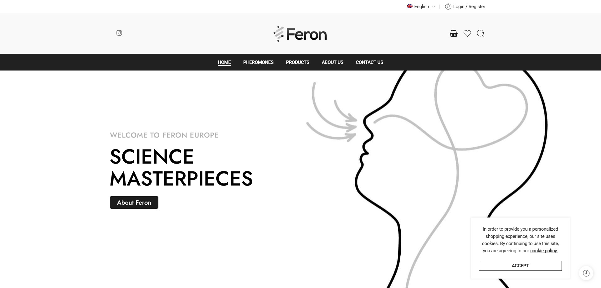
Feron presented a rare and demanding design challenge: a cosmetics brand that sits at the intersection of science, sensuality, and consumer trust. The visual identity was built to communicate all three simultaneously. A near-black background deepens into dark charcoal and cool graphite tones, anchoring the brand in scientific credibility, while restrained violet and silver accents carry the sensory and premium dimensions of the product range. The result is a palette that reads as laboratory-precise and aspirationally desirable in equal measure.
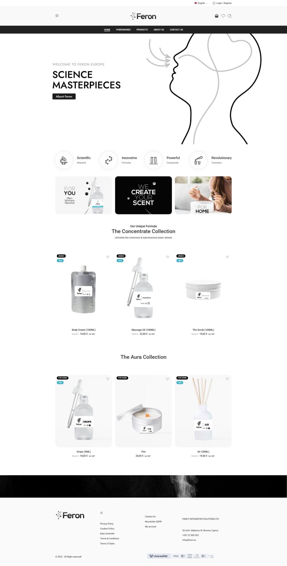
Typography was selected to reinforce the brand’s positioning as a science-led innovator. A clean geometric sans-serif dominates — precise, modern, and neutral enough to carry technical product language without feeling cold. Headline treatments on the homepage use stacked single-word descriptors (“Scientific · Research · Innovative · Formulas · Powerful · Compounds · Revolutionary · Cosmetics”) as a graphic device, functioning simultaneously as brand manifesto and kinetic visual element.
Product photography and packaging design were handled within a strict visual discipline: airtight sealed packaging photographed against dark studio backgrounds, with ingredient callouts and certification marks (cruelty-free, vegan, no animal testing) given graphic prominence as trust signals rather than fine print. Sale badges and “Limited” edition labels were designed to create urgency without cheapening the premium positioning. The overall visual language deliberately distances Feron from the crowded mainstream cosmetics shelf — it reads closer to a pharmaceutical innovation brand than a beauty retailer.
Design approach
The central UX challenge was credibility. Feron’s product proposition — patented formulas that activate the conscious and subconscious senses — is genuinely novel and sits outside the conventions of standard cosmetics marketing. The design had to build trust before explaining the science, and explain the science before asking for a purchase. The information architecture reflects this: a dedicated Pheromones section addresses the category directly and pre-emptively, distinguishing Feron’s certified cosmetic formulas from unsubstantiated pheromone sprays and positioning the brand’s years of R&D as its core differentiator.
Product pages lead with formula mechanics — how the product works, where to apply it, what it activates — before moving to product specifications (size, shelf life, certifications). This mirrors the brand’s own language: Feron sells a scientific outcome, not a fragrance. The layout was designed to honour that hierarchy.
The discreet packaging promise — each order ships with no indication of contents — was surfaced as an explicit design element on the site, acknowledging the privacy needs of the customer base without drawing undue attention to it. This kind of considered UX copy placement is as much a design decision as a visual one.
Technical build
The site was built on WordPress with WooCommerce, using a custom theme developed to meet the brand’s exacting visual and functional requirements. The product catalogue is structured across two primary lines — body-use cosmetics (body cream, massage oil, scrub, concentrate, myst) and atmosphere products (drops, air mist, reed diffuser) — with further filtering by gender targeting (For Her, For Him, Unisex) and product type. VAT-inclusive EU pricing is applied throughout, with sale and “Limited” stock states handled dynamically.
The distribution model — exclusive direct-to-consumer, EU-wide, via the official website only — placed particular importance on the checkout and returns experience. An airtight sealed packaging returns policy was implemented with explicit conditions communicated at the product and cart level, reducing disputes and protecting both the customer and the brand. A newsletter signup system supports ongoing customer retention, and GDPR-compliant cookie consent was implemented in line with EU regulations for the .eu domain registration.